The R (version > 2 required for transparancy plots) code for creating the
plots shown below can be found in map.r. I'm not
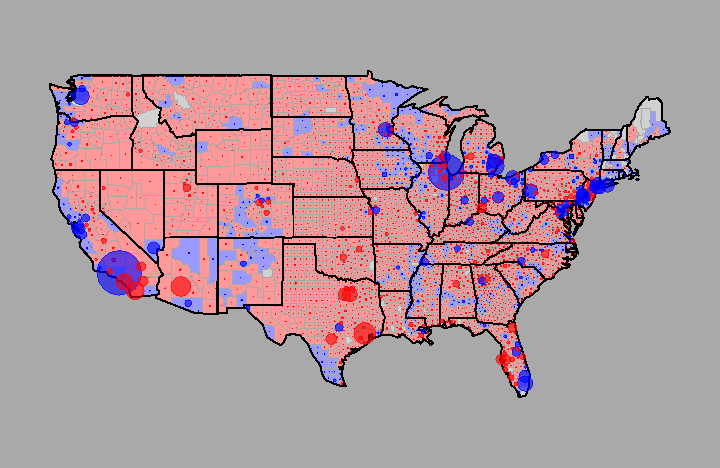
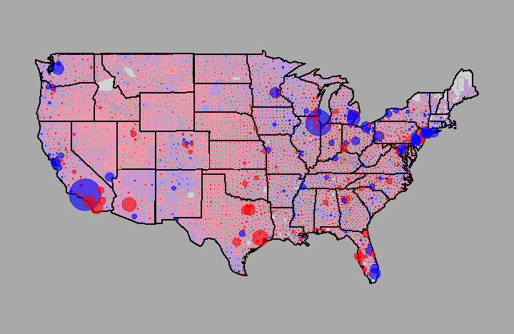
completely happy with the coloring of the counties, I would like to use
something that would make the counties in which there was a 50/50 outcome
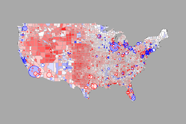
more neutral colored. If you know a way, please let me know. (04/12/10: Solved
with help from Gregoire Thomas, see first plot below, which I'm extremely
happy with.)
These plots are based on a plot that appeared in a New York Times flash-based editoral, available here. Note that there are some differences in the maps shown below and the NYT maps, most notably with respect to some missing data in some New England states, some mismatches in county names, and the representation of NYC.
Files necessary:
HvR, 041210